|
Balance 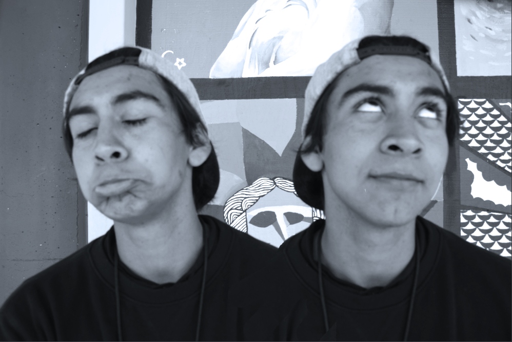 ISO 400, Aperture f/8, SS 1/320 A) This photo is of my photography partner and also an homage to Annie Leibovitz for Vogue of Cate Blanchett. B) The principle of balance is shown within the photograph in that the photo can be split in half vertically, and two Tony's (my partner) would be symmetrical and proportioned. C) This photograph is successful because my idea for creating an homage came out decently. Proportion 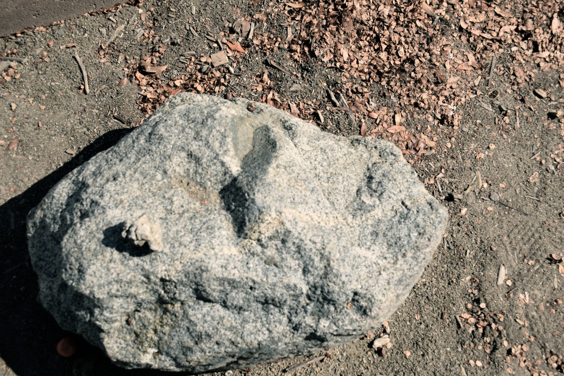 ISO 400, Aperture f/8, SS 1/1,600 A) This photograph is of two plain rocks at RBV. B) The principle of proportion is in this photo by the placing of the smaller rock on top of the larger rock. The shadow of the small rock captures the larger rock's vastness compared to it's opposite. C) I would say this photo is successful because I think I achieved the goal decently. Rhythm 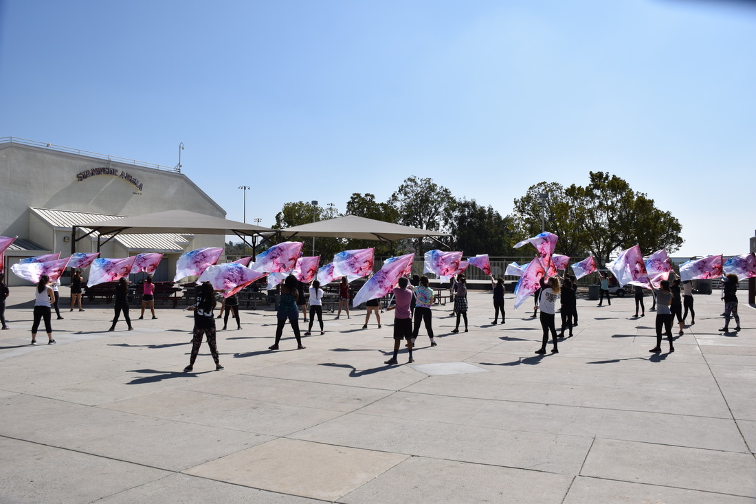 ISO 400, Aperture f/8, SS 1/1,200 A) This photograph is of our amazing color guard perfecting their performance during school. B) The principle of rhythm is shown with the color guard members being synchronized. C) This photograph is successful because it captures the concept of rhythm. Emphasis 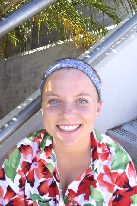 ISO 400, Aperture f/8, SS 1/320 A) This photograph is of the bubbly Brooke Wilson. B) The principle of emphasis is shown through Brooke's eyes. I wanted to get a portrait for emphasis to emphasize someone's unique quality, which is her blue eyes. I feel that the shirt and headband contrast her eyes, which somehow gives emphasis to the blue in her eyes. C) I would say this photo is somewhat successful because I focused on giving her eyes emphasis. Harmony 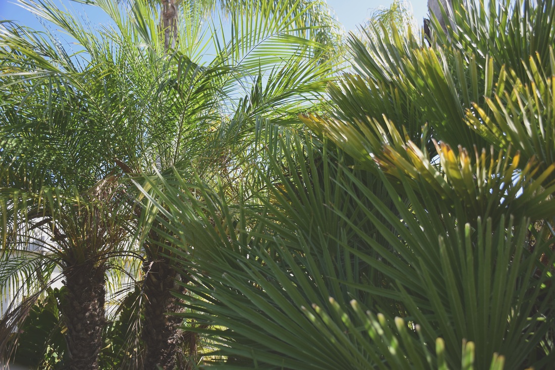 ISO 400, Aperture f/3.5, 1/1,000 A) This photo is of some greenery at RBV. B) The principle of harmony is shown in this picture through the dominant green. The low contrast of the photo also gives a soft, yet reassuring impression on the viewer. C) This photo is successful because it achieves the oneness of colors. Variety 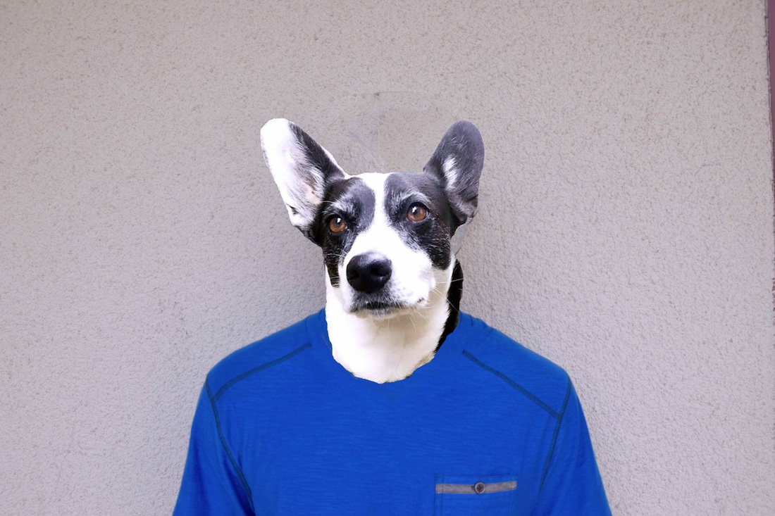 ISO 400, Aperture f/8, SS 1/350 A) This photograph is of my dog's head on the body of my photography partner's body. B) I loved the photos from variety with the dogs, so I was inspired to attempt that same idea. So, variety is created by my dog's head being on a human body. C) I hoped it would come out better, but the attempt at creating the same idea came out decent in achieving variety. Unity  ISO 400, Aperture f/4, SS 1/1,600 A) This photo is of nature on RBV's campus
B) The principle of unity is shown in that a sense of oneness is established, The leaves look to have been naturally placed. C) The photograph is successful because the idea of everything seeming to be in the right place is achieved.
0 Comments
Line 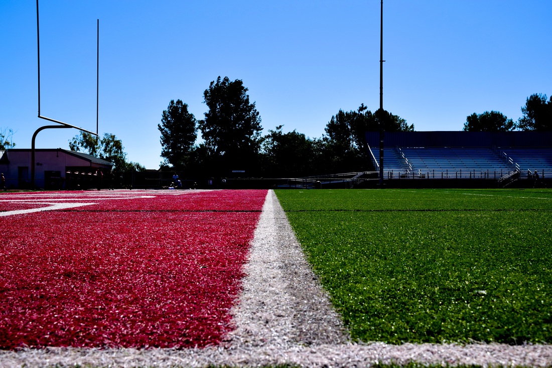 ISO 400, Aperture f/8, SS 1/1,600 A. This photo is of the 10 yard line on the football field in RBV's stadium. B. The principle demonstrated in this is line. The line guides the viewers eye. C. The photograph successfully demonstrates line is like I wrote above, the line guides the viewer's eye with a large depth of field. Color 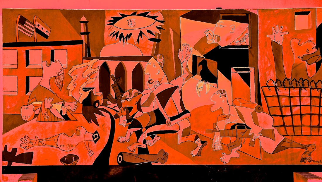 ISO 400, Aperture f/8, SS 1/1,000 A. This photo is of my favorite mural on RBV's campus, it is a formation/allusion to Picasso's "Guernica" B. The principle within this photo is quite obvious, it is color. The red hue is the first thing the viewer notices C. This photo is successful because I focused on a monochromatic aspect of color. Shape 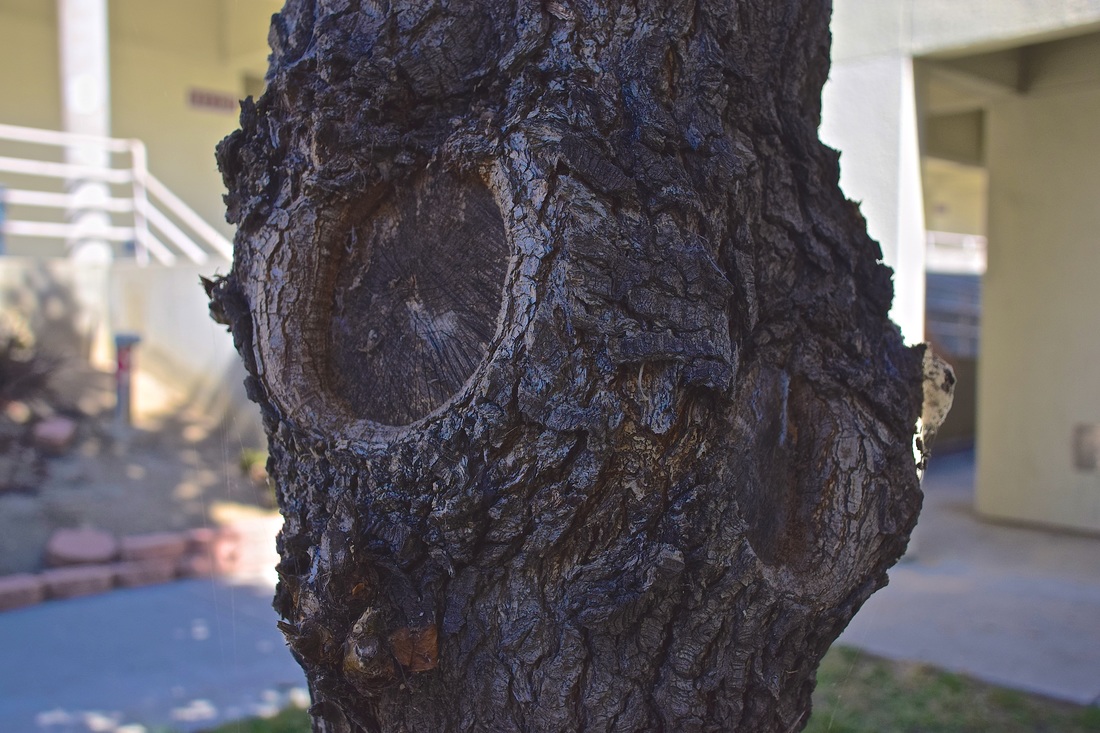 ISO 400, Aperture f/3.8, SS 1/1,600 A. This picture is of an ordinary tree on campus. B. The principle of shape is displayed in this photo, the viewer can see the formed circles in the tree. C. This photo is successful because I wanted to take a picture of something not geometric, since that is more typical to see. Form 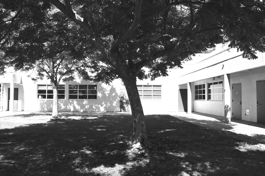 ISO 400, Aperture f/8, SS 1/1,600 A. This photo is of a nice, peaceful grass area on campus. B. The photo displays form in its depth and height. The viewer can see the tree is cut off, which shows height, and the viewer can see what is behind the tree. C. It is successful because the sun highlights the beautiful shadow of the tree. Texture 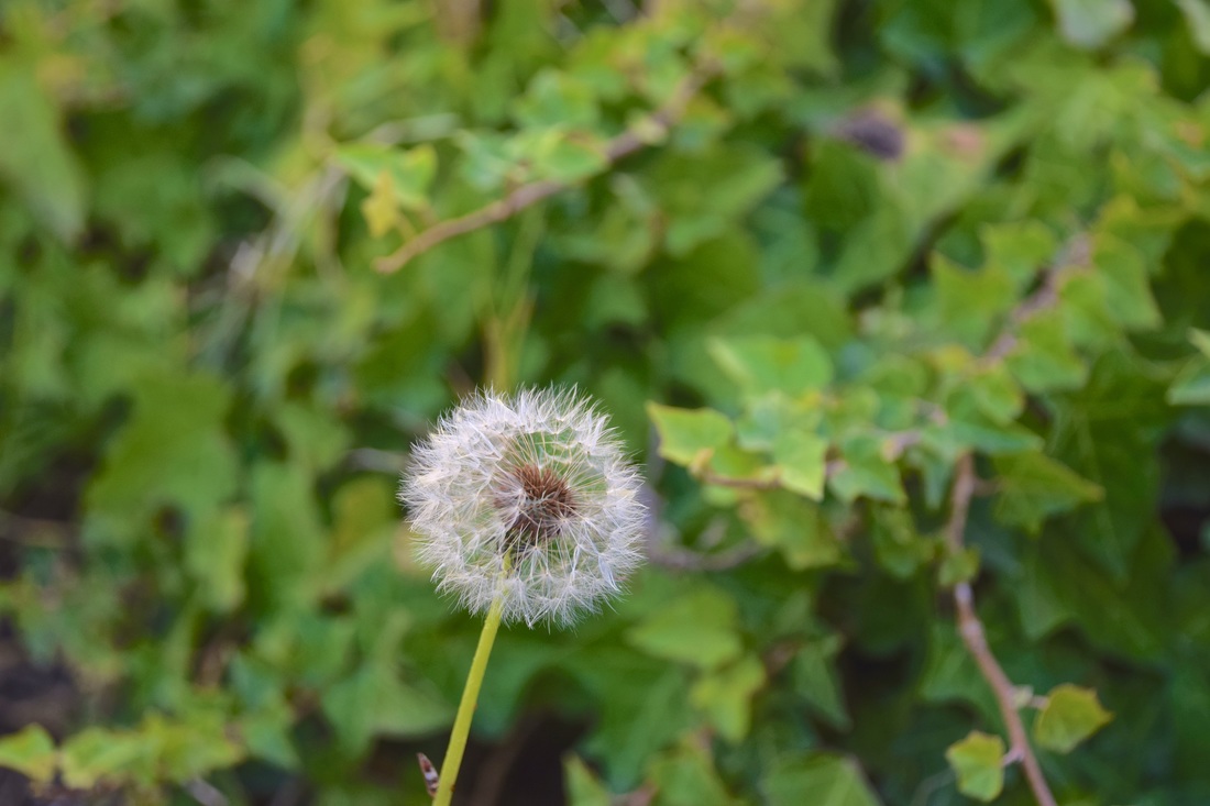 ISO 400, Aperture f/5, SS 1/500 A. The photo is of a dandelion I spotted. B. The element of texture is shown with the flower being the focal point, with the back blurred out. C. The photo is successful because the flow is intensely focused. Space 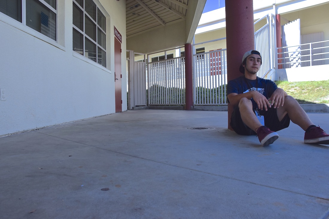 ISO 400, Aperture f/8, SS 1/640 A. This photo is of my photo partner Tony, sitting in the hallways. B. The element of space is shown in this photo, specifically negative space to have the space surround Tony. C. This photo is successful because it captures the element of space and the aesthetic purposes in negative space. Value 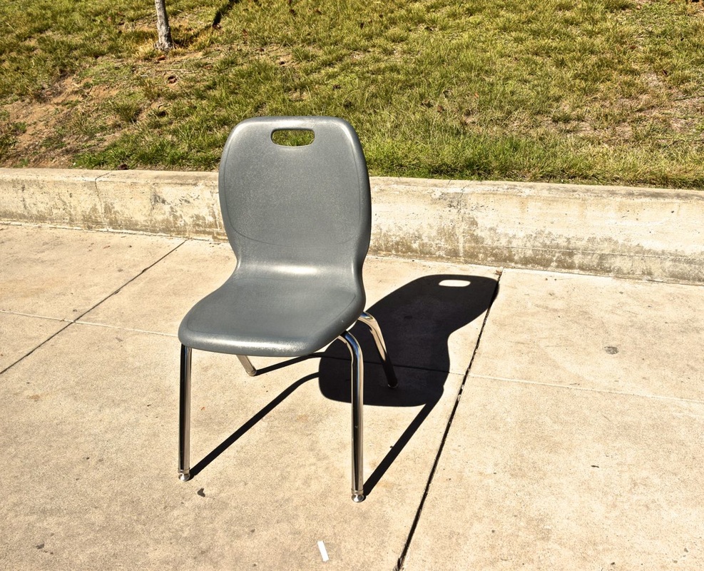 ISO 400, Aperture f/8, SS 1/2,000 A. This photo is of a random chair I wanted to snap a picture of.
B. The element of value is shown through the darkness of the shadow and the lightness the sun shines on the chair C. This photo is successful because it captures the idea of value with lightness, darkness, and shading Elements of Art
Line
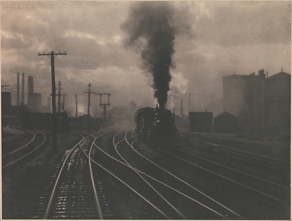 Alfred Stieglitz, "The Hand of a Man", 1902 http://www.metmuseum.org/art/collection/search/269461 In this photograph, line is displayed through railroad tracks. Stieglitz was able to vertically lead the audience's eyes to the focal point, the train on the tracks. By using the vertical railroad tracks, the photographer was able to successfully lead the viewer to see the train, swallowed by the smoke and gloom. Color
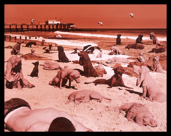 Sandy Skoglund, "Dogs on the Beach" ,1992 http://www.sandyskoglund.com/pages/imagelist/imagelist%20home.html In this image, Sandy Skoglund is able to display the element of color through contrasting the dark colors from the dogs coats of hair to the red hue. The different blacks and browns of the dogs, the ocean, the sky makes it to be monochromatic showing the alternate contrast of everything in the picture to the red. Shape
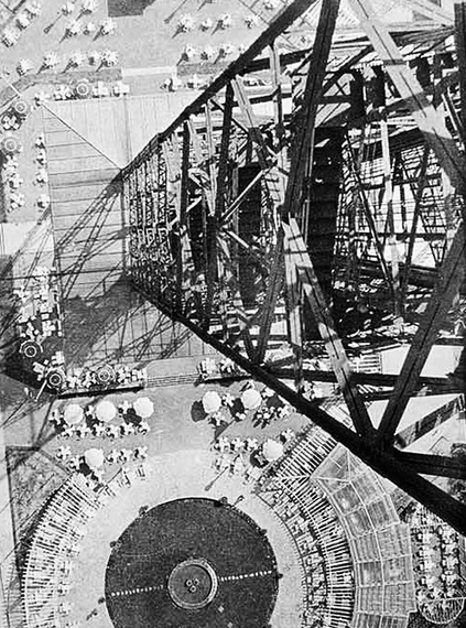 László Moholy-Nagy , "Berlin, Radio Tower ,1928 http://www.moma.org/collection/works/84043?locale=en This photo portrays inorganic shapes, the tower has different diagonal lines and shapes that are seen from the high bird's eye view. Form
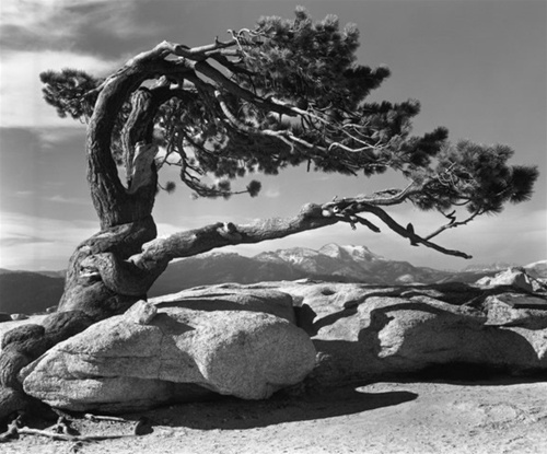 Ansel Adams, "Jeffrey Pine", 1940 http://anseladams.com With the use of shadow, we can see the height of this slanted tree. Texture
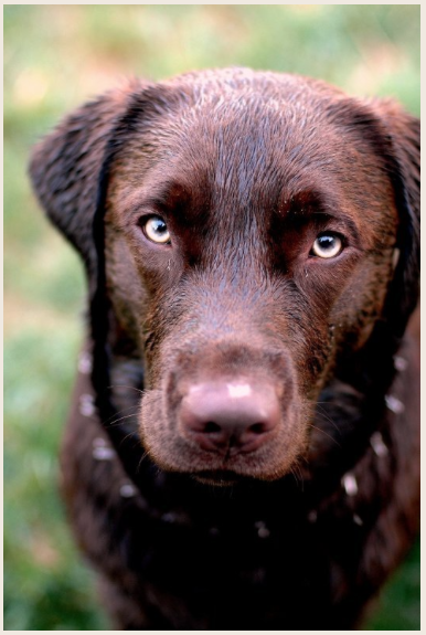 Kelly Moncure, , "Chocolate Lab" ,2007 http://www.kellymoncure.com/#!/page/391510/pets This photo depicts a picture with texture because it's so clear, we can imagine vividly what the dog's hair would feel like to pet he/she. Space
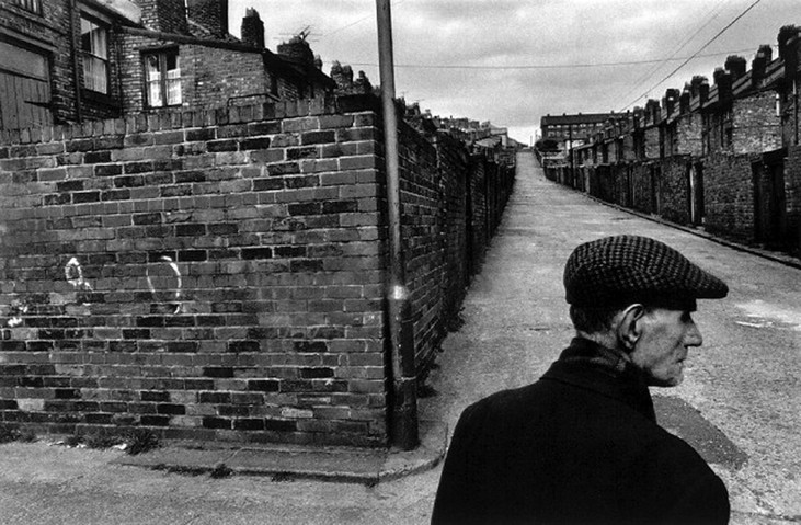 Josef Koudelka, "Great Britain" , 1976 http://theartofphotography.tv/photographers/koudelka/ In this photo, Koudelka uses negative space. The space is around the primary object which is the older man. Value
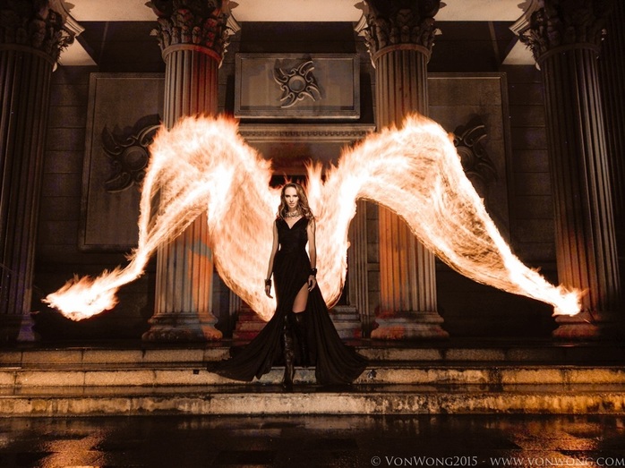 Ben Von Wong, "Fire Angel", 2015 http://www.vonwong.com Wong shows the value of lightness and darkness with the flames and the darkness surrounding them. Balance
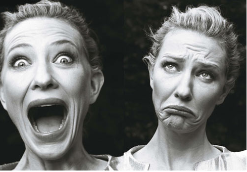 Annie Leibovitz, for Vogue: Cate Blanchett, 2009 http://kottke.org/tag/Annie%20Leibovitz This photo depicts balance because if we were to split the photo vertically in half, the model would evenly be shown in both pictures. Proportion
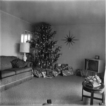 Diane Arbus, "Xmas Tree in a Living Room", 1963 https://www.nationalgalleries.org/collection/artists/diane-arbus/24654 Arbus demonstrates proportion in this photo with an oversized Christmas tree in an ordinary living room.Or it can be seen the other way, a average sized Christmas tree placed in a small room. Rhythm
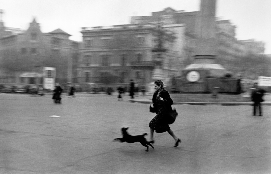 Robert Capa, "Running for shelter", 1939 https://pro.magnumphotos.com/C.aspx?VP3=CMS3&VF=MAGO31_10_VForm&ERID=24KL535353 Robert Capa makes this photo seem active, since he is capturing motion. It indicates a rhythm of the lady running. Emphasis
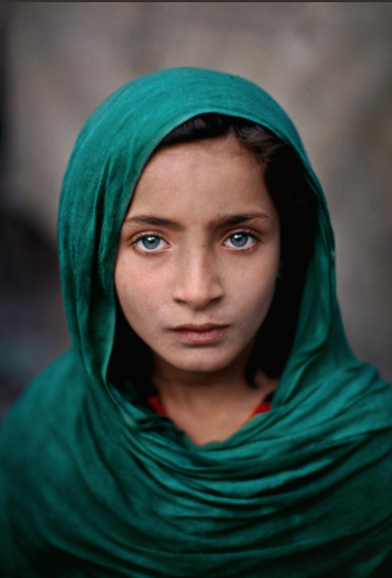 Steve McCurry: Peshawar, Pakistan, 2012-2016 http://stevemccurry.com/galleries/portraits McCurry emphasizes the girl's eyes to correspond and brighten with the green hijab. The two attract the viewer's eyes. Harmony
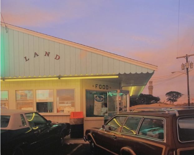 Joel Meyerowitz: "Land", 1976 http://www.howardgreenberg.com/exhibitions/joel-meyerowitz-50-years-of-photographs-part-ii-1976-2012?view=slider#21 Meyerowitz achieves harmony with similar, soft colors in this photo. Variety
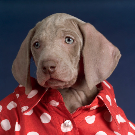 William Wegman: "Youngster", 2005 http://www.panopticongallery.com/artist/wegman/#William_Wegman_32.jpg The photography incorporates his own interests (his dog) to achieve the contrasting elements like; a puppy dressed up in human clothes. Unity
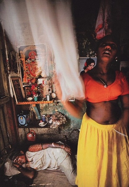 Mary Ellen Mark, "Midafternoon", 1978 http://www.maryellenmark.com/books/titles/falkland_road/index001_falkrd.html
Unity is shown here through dark tones of people, the ground, and the wall. By connecting the color of the people with the color of their surroundings, unity is displayed with the unifying color play between elements. 1. I set my camera on "Shutter Priority", with a shutter speed of 1600.
2. The only difficulty I can think of was capturing the action, whether I took the picture too fast or too slow. The way I corrected it was just taking a lot of pictures at once, with one of those several capturing the motion. 3. Top three things:
 When we were assigned this project, the first thing I did was look up the exact definition of self-respect. The definition is: “pride and confidence in oneself; a feeling that one is behaving with honor and dignity”. I had difficulty with thinking of ideas to convey this definition through a photo. Once I took my pictures, I made my vision a reality. I did all my editing through Adobe photo shop. It was a matter of trial and error, since it was my first time using adobe photo shop.
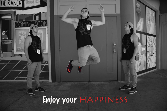
I had my model, Tony, do three poses for me. Two profile shots and a center shot of him jumping with joy in the air. I had him to do this so that I could create my vision of showing the idea, “enjoy your happiness”. The two clones looking up to himself jumping in the air, symbolize his inner feelings towards himself. The center Tony, clearly looks happy, expressing his happiness freely. My intention and purpose of the photo is to convey that being confident in oneself is a good thing, and nothing to be ashamed of. 1. I took these pictures in a pretty much pitch black room. The camera was secured on the tripod, set in manual mode with manual focus. With the light painting, all I had my partner do was to make designs with the light once I said "go". My partner used glow sticks and the app called "mil light paint" to create the light paint.
2. The struggle I had was getting my partner to be seen in the background of the photo. With most of them, the design made with the light is seen, but with nothing else seen, just pitch black. 3. The three most important things with light painting:
4. When pictures were being taken of me, I kept trying to write out my name. SO that would be the idea I'd want to capture if I were to try again. 1. To focus on shutter speed, I had to set the camera to "shutter priority" on the dial versus "aperture priority". On the top dial of the camera, I simply switched it to the "S" on the dial. Setting it to shutter speed priority focuses on capturing movement of what is in front of the lens.
2. When the shutter speed is altered, clarity of movement in front of the lens is either very distorted or very clear. The lower the shutter speed, the more abstract and the movement isn't captured as clear as a higher shutter speed would. With that being said, the larger the shutter speed, the clearer the movement is captured. For the first photograph, the girl in the front is the center focus. The people behind her are jumping, and as they jumped I snapped the photo. Since the shutter speed is low, the motion of them jumping makes the photo to be contorted, and their movement isn't as clear or captured as it would be if the shutter speed is higher. Comparing the photo with a shutter speed of 1/3, to the last photo with shutter speed of 1/1000. The people in the background look like they are floating, but really with the higher shutters speed captures them clearly in mid-air. 3. When to use shutter speed all depends on the photographers intention, of what he or she wants to express through the photo. For example, to capture the motion of someone running, a lower shutter speed would visualize movement. To capture a close-up of planes flying in the air, a higher shutter speed would freeze that moment in the air. 4. Notes on shutter speed -Shutter speeds are both a technical and aesthetic choice a photographer needs to make before releasing the shutter
The Daguerrotype: The Daguerrotype system was invented by Louis Daguerre in 1839. He built off of Nicéphore Niépce, the inventor of the first photograph.Before then, nothing was available to capture a moment like photos do. To make a daguerrotype, one would polish a sheet of silver-plated copper to a mirror finish, treat it with fumes that made its surface light sensitive, expose it in a camera for as long as necessary , which could be as little as a few seconds for bright sunlight to make the resulting latent image on it visible by fuming it with mercury vapor; remove its sensitivity to light by liquid chemical treatment, rinse and dry it, then seal it behind glass. 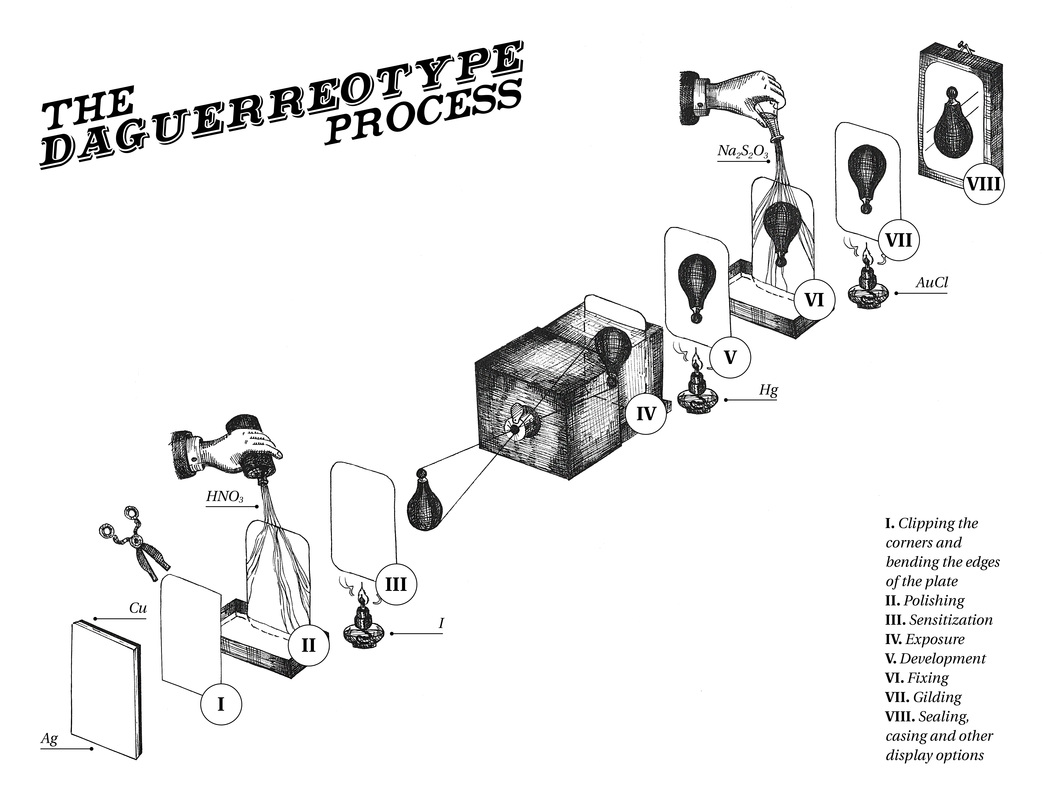  The Cyanotype: The Cyanotype was developed by Sir John Herschel in 1842, it's been said that he could have been the inventor of photography if he pushed his work to it. Anna Atkins promoted the cyanotype by publishing several books that documented ferns and other plants. The cyanotype became known as the blueprint. The chemicals used to produce the cyanotype are potassium ferricyanide and ferric ammonium citrate. In the procedure, the two solutions are mixed, the mildly photosensitive solution is then applied to a receptive surface (paper or cloth) and allowed to dry in a dark place. Cyanotypes can be created on any surface that absorbs iron. Once the photo is developed, the picture is unreacted and yellow. Running it under water will create the blue effect. Step by Step to create a Cyanotype:
 Before with first cyanotype 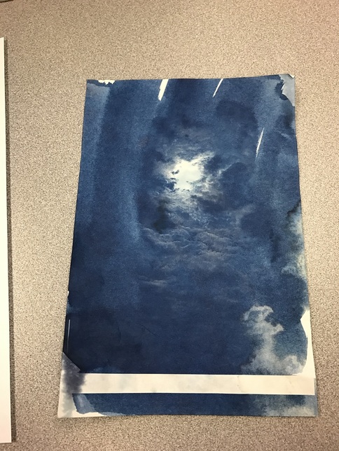 After of first cyanotype with digital negative  Before of second cyanotype with botanicals 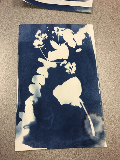 After, second cyanotype with botanicals 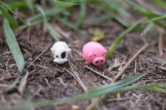 "Milky and Piggy, Lost in the Jungle!" Aperture f/1.8, Shutter Speed 1/3,200, ISO 400 Piggy and Milky are lost and alone. They need to find their way back home! At the farm is where they need to be, but instead here they are, in the jungle unclear of the way go. How will they get to the farm? 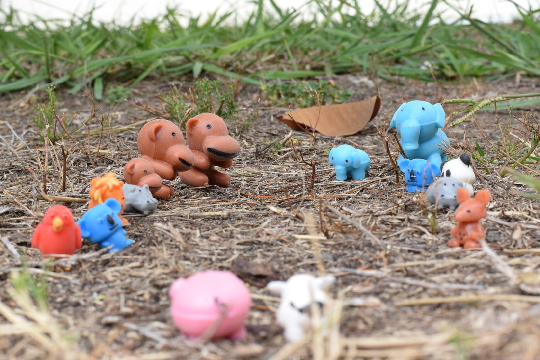 "Pathway of Jungle Animals", Aperture f/16, Shutter Speed 1/125, ISO 400 Piggy and Milky find themselves far away from the farm. The way they will find their way home is to ask the animals they meet for directions. All these jungle animals look intimidating, they must be brave! 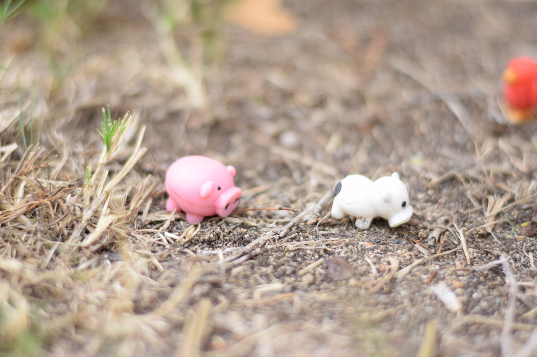 "Milky is brave!" Aperture f/1.8, Shutter Speed 1/4,000, ISO 400 Piggy is scared to ask for help, but Milky is brave. Milky will ask the jungle animals for the directions they need to get back to the farm. 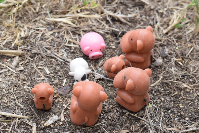 "The monkeys are bullies!" Aperture f/8, Shutter Speed 1/320, ISO 400 Before they can move forward, the monkeys of the jungle surround Milky and Piggy. They are unsure of what to do since the bully monkeys outnumber them. The monkeys are known for being mean to the new animals that enter the jungle, but what will little Piggy and Milky do? 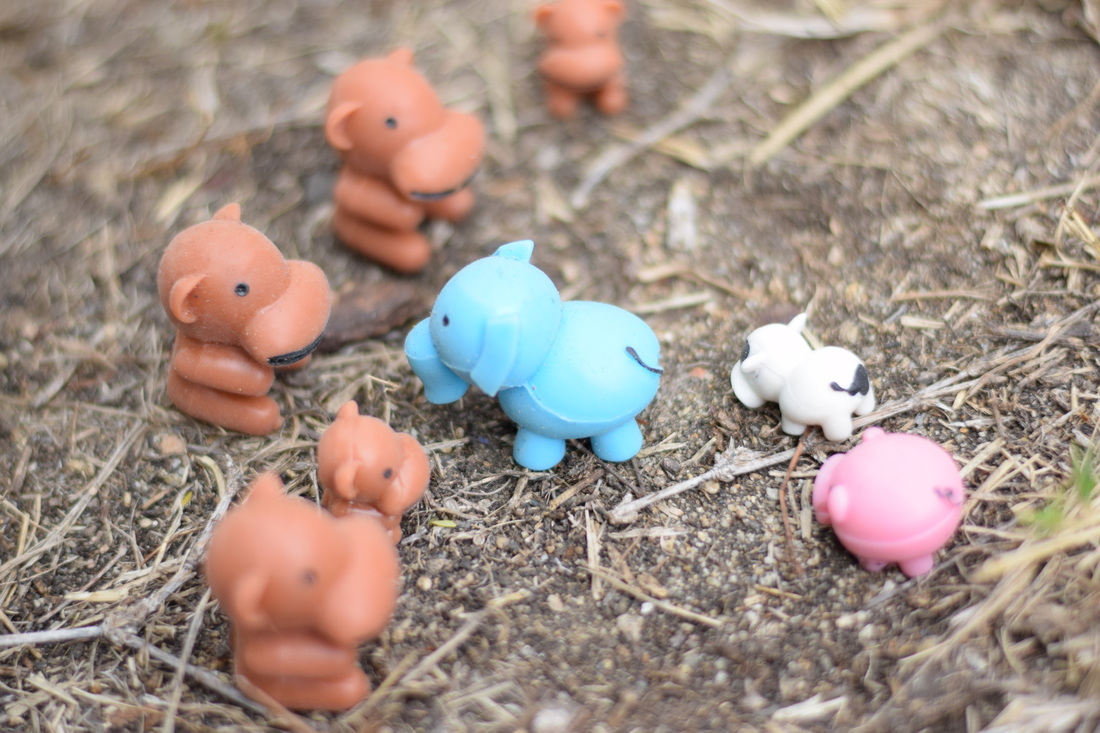 "Hero to the farm animals" Aperture f/1.8, Shutter Speed 1/4,000, ISO 400 The nice blue Elephant saves Milky and Piggy! She goes to scare off the monkeys, and her and all the other jungle animals lead them the way towards back home at the farm. Piggy and Milky are now on their way to the farm, with the help of the nice elephant and jungle animals. 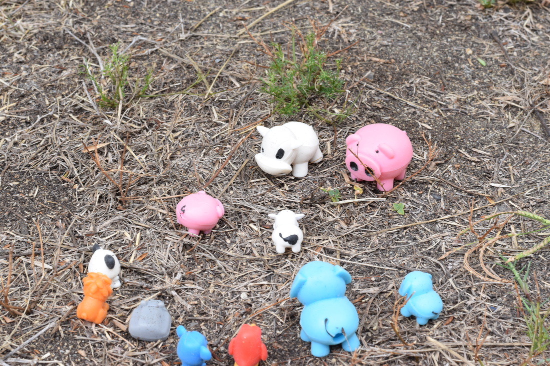 "Home Sweet Home!" Aperture f/1.8, Shutter Speed 1/4,000, ISO 400 Milky and Piggy were able to escape the mean monkey's tormenting. Without the blue elephant and the nice jungle animals, Milky and Piggy would not have been able to get back to the farm. They made sure from now on to never wander off from the farm again!
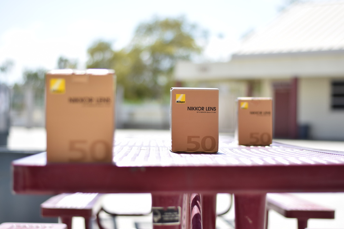 Aperture f/1.8, Shutter Speed 1/4,000, ISO 200 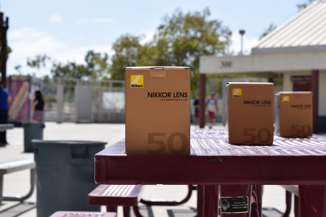 Aperture f/8, Shutter Speed 1/640, ISO 200 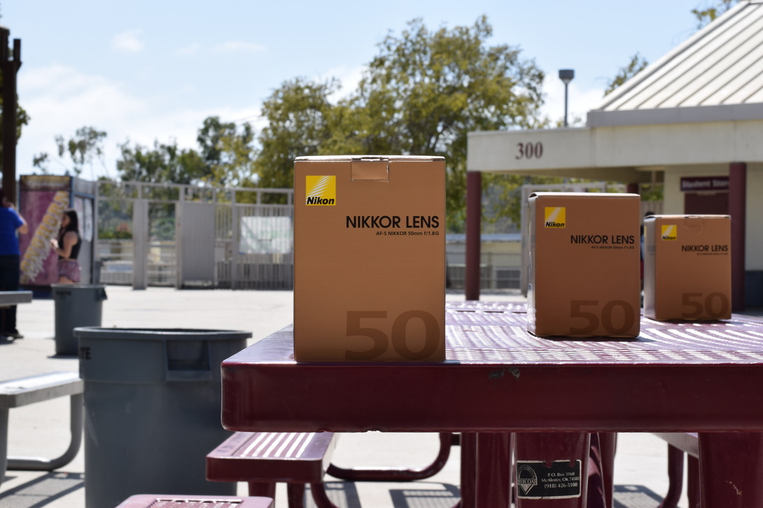 Aperture f/16, Shutter Speed 1/160, ISO 200 For each picture, the first and closest box is what should be focused on. My first photo actually focused on the middle box, but that's okay because the aperture is well captured. With that first photo, everything other than the middle box is blurred out. The reason and key to that was because of the aperture. The aperture of that photo was f/1.8, which was the smallest capability. With a small aperture, the DOF, or depth of field, is decreased. Everything that is blurred out in that first photo is what could be a wider depth of field, but because of the smaller aperture, the camera focused on the middle box and blurred everything around it.
The second photo taken has an aperture of f/8. We increased the aperture to increase the depth of field, and this time it is focused on the first and closest box. The photo isn't a hundred percent clear, but there is a significant difference with the amount of blur. You can tell with the blurred people and tree in the background, they're not focused on, but the figures are formed whereas with the photo with f/1.8 aperture, those objects in the background can't be formed. The third and final photo taken has the largest aperture of the three taken. It has an f/16, which has a large depth of field. In other words, everything is almost fully clear, with little blurred out. All three boxes are clear, the background is somewhat blurred, but everything can be clearly formed and figured. Since it has a large aperture, the depth of field is increased. The first photo had small aperture, so everything was blurred other than the box focused on. While the last photo had a large aperture, everything can be seen, everything past the focused box can be seen, the depth of field. |
AuthorHigh school student learning how to capture priceless moments through a lens. Archives
May 2017
Categories |
 RSS Feed
